
Choosing the right paint color can be both exciting and overwhelming. With thousands of shades available and subtle variations that can change with the lighting, it’s no surprise many people struggle to pick the perfect hue. The good news is that with a few practical tips and a basic understanding of color theory, choosing wall colors that complement your space becomes a lot easier.
Whether you’re giving your living room a facelift, repainting your kitchen, or planning an entire home refresh, this guide will walk you through how to choose paint colors that work for your space, your style, and your mood.
Why Paint Color Matters
Paint isn’t just about aesthetics. The right color can completely transform how a space feels and functions. Soft tones can make a small room feel more open, while bold shades can add drama and personality. Color has the power to influence mood, highlight architectural features, and tie together your overall interior design.
Many homeowners worry about picking the wrong color, but remember: it’s just paint. It can always be changed. The key is making an informed choice that reflects your personal style and fits your space.
Understanding Color Theory Basics
Before diving into home paint color ideas, it’s helpful to understand some basics of color theory. This will help you narrow down options and choose hues that create harmony in your home.
Warm vs. Cool Tones
-
Warm colors include reds, oranges, and yellows. These create cozy, energetic environments and are great for social areas like dining rooms and living rooms.
-
Cool colors include blues, greens, and purples. These shades tend to feel calm and refreshing, making them perfect for bedrooms and bathrooms.
Primary, Secondary, and Tertiary Colors
-
Primary: Red, blue, yellow
-
Secondary: Orange, green, purple (made by mixing primaries)
-
Tertiary: Created by mixing primary and secondary colors
Understanding these relationships helps in coordinating different colors in a room.
The 60-30-10 Rule
This popular design rule suggests using:
-
60% of a dominant color (e.g., walls)
-
30% of a secondary color (e.g., upholstery)
-
10% as an accent (e.g., accessories or trim)
This ensures a balanced and cohesive color scheme.
Match Color to the Room’s Purpose and Mood
When choosing wall colors, consider what kind of atmosphere you want to create.
-
Bedroom: Soft neutrals, calming blues, or gentle greens are ideal for relaxation.
-
Living Room: Warm neutrals, earthy tones, or rich hues like navy or charcoal offer comfort and elegance.
-
Kitchen: Whites, soft greys, or muted greens can feel clean and energizing.
-
Home Office: Focus-friendly tones like sage green, slate blue, or warm beige help concentration without overstimulating.
-
Bathrooms: Spa-like tones such as pale blues or warm whites create a fresh, clean vibe.
Color evokes emotion. Think about how you want to feel in the space, and choose accordingly.
Consider the Lighting
Lighting dramatically affects how a color looks on your walls. The same paint can look completely different under natural daylight, incandescent bulbs, or LED lights.
Natural Light
-
North-facing rooms: Often cooler and dimmer, so warmer tones can help balance the chill.
-
South-facing rooms: Bright and warm, which can handle cooler tones without feeling cold.
-
East-facing rooms: Bright in the morning, softer in the afternoon—light, warm colors work well.
-
West-facing rooms: Warm in the evening, which can bring out red or yellow undertones.
Always test paint in the actual room at different times of day to see how it shifts.
Coordinate with Fixed Elements
One of the most important interior paint color tips is to consider the materials that aren’t changing like floors, cabinetry, countertops, or major furniture pieces. Look for undertones in those elements (warm or cool) and pick paint colors that harmonize.
For example, cherry wood floors with warm undertones pair beautifully with warm beige or olive green walls. Cool-toned marble countertops might be better complemented by soft greys or icy blues.
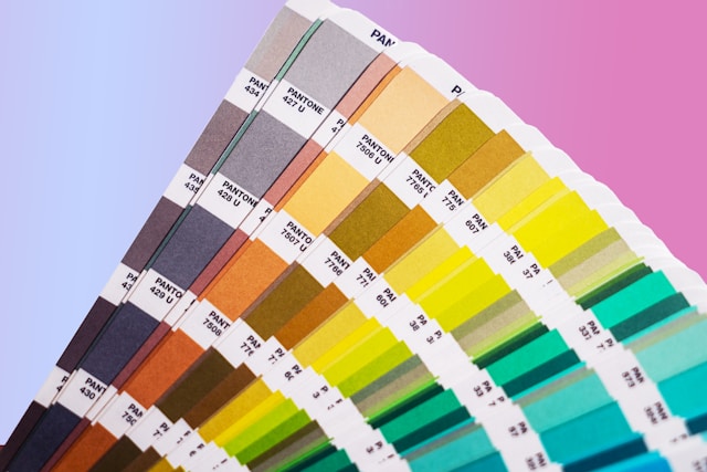
Use Paint Samples Wisely
Don’t rely solely on paint chips. Instead, invest in small sample cans and test on your walls.
Tips for testing paint colors:
-
Paint large swatches directly on the wall or on foam boards you can move around.
-
Look at the color in both natural and artificial light.
-
Give it a few days. Colors can grow on you or start to feel wrong over time.
When choosing paint colors for your home, patience is key. A rushed decision can lead to regret, but a little extra testing time often results in the perfect pick.
Trending Paint Colors vs. Timeless Choices
While it’s fun to explore popular colors, trends come and go. Consider whether you want something bold and current or something classic that will age gracefully.
Trending Colors (as of recent years):
-
Sage green
-
Terracotta
-
Dusty rose
-
Deep navy
-
Charcoal grey
Timeless Paint Choices:
-
Soft white (like Benjamin Moore’s White Dove)
-
Greige (a warm blend of grey and beige)
-
Taupe
-
Pale blue or green
-
Muted earth tones
You can always incorporate trendier colors through accents like throw pillows, art, or decor if you want to keep your wall color timeless.
Tips from Interior Designers
Professional designers know how to choose paint colors that work, and they often recommend these key strategies:
-
Avoid too many bold colors in small spaces. It can feel overwhelming.
-
Stick to a cohesive palette across your home. Vary the depth or hue, but keep things flowing.
-
Use color visualization apps. Tools from brands like Sherwin-Williams or Benjamin Moore let you upload photos and preview colors digitally.
-
Don’t ignore the ceiling and trim. Crisp white ceilings can open up a space, while colored or darker ceilings add drama.
And perhaps most importantly: Don’t second-guess your taste. If you love a color, that’s reason enough to use it.
Final Thoughts
Choosing paint colors doesn’t have to be stressful. With the right approach, you can create spaces that feel like home and reflect your personality. From understanding how lighting impacts hue to coordinating with your home’s existing features, every step brings you closer to finding the perfect color.
So take your time, test thoroughly, and trust your instincts. Whether you’re leaning into the latest trends or sticking with timeless tones, the best paint colors for your home are the ones that make you feel good every time you walk in.